Mango & Marigold Press

overview
Mango & Marigold Press is an award-winning independent publishing house that shares the sweet and savory stories of the South Asian experience. The founder, Sailaja Joshi started the press when she struggled to find children's books that depicted her own Indian culture. Fueled by the power of representation, Mango & Marigold Press has received several awards for cultural diversity. Formerly known as Bharat Babies, our client wanted to focus on a wider demographic, which led to a name change and a complete rebrand, complete with a new ecommerce site. I worked with a team of 5 designers and developers to create this rebrand.
AREAS OF FOCUS
Custom Shopify Development
UI/UX Design
Branding
TOOLS
Figma
Shopify Slate
ROLE
Designer & Developer
moodboard & research
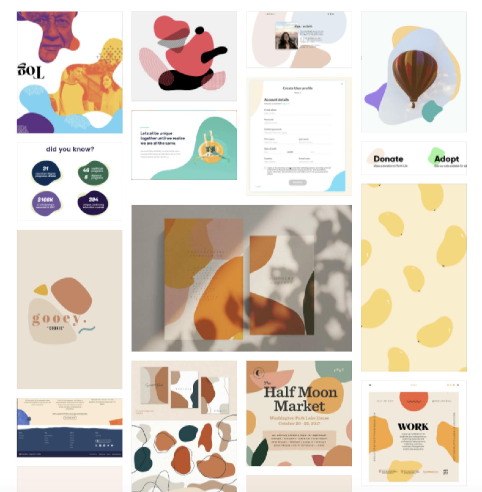
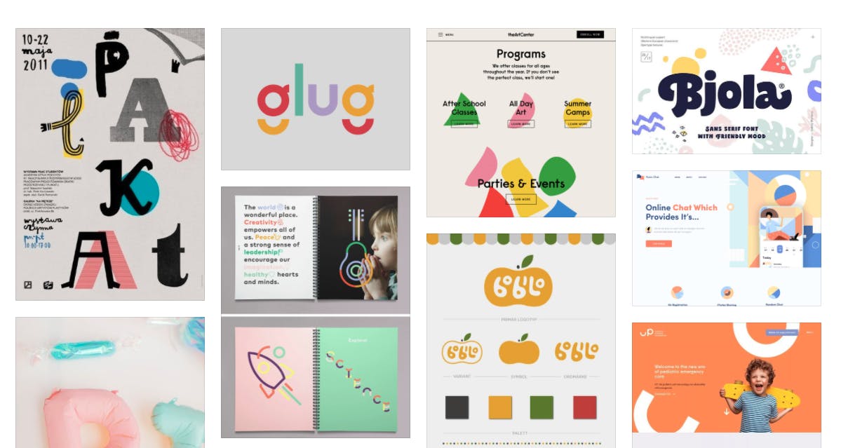
We presented the client with different pieces of inspiration in order to determine the style and feel that the company was going for. Lighter, pastel shades, as well as handmade, abstract, mango-like shapes and textures resonated with our client the most.


different stylistic elements that resonated with our client
logo
The logo for Mango & Marigold’s new brand went through many iterations. It was easy to jump to visualizations of mangos and marigold flowers. However, we found that a mango shape was not very distinct and the detail required to portray a marigold was too complex for a logo. Additionally, since we were designing for a literary press, the logo needed to go beyond the literal and emphasize creativity and discovery. Our breakthrough on the logo didn’t come until after defining the rest of the branding elements. The direction to head in for color and typeface was much clearer. Moving forward, with those elements, our team also began to explore blob shapes as supporting elements on the website.


logo: before & after
branding
Based on the client feedback we received during our moodboard sessions, we developed a brand based on the elements that the client resonated with most. Our color palette consisted of warm tones that compliment the textures we created (with actual mangos and marigolds!).
initial wireframes
Low-fidelity wireframes for the ecommerce site were created by taking into account features that the client wanted for the site, such as a blog and customizable filter options for products.
applying styling
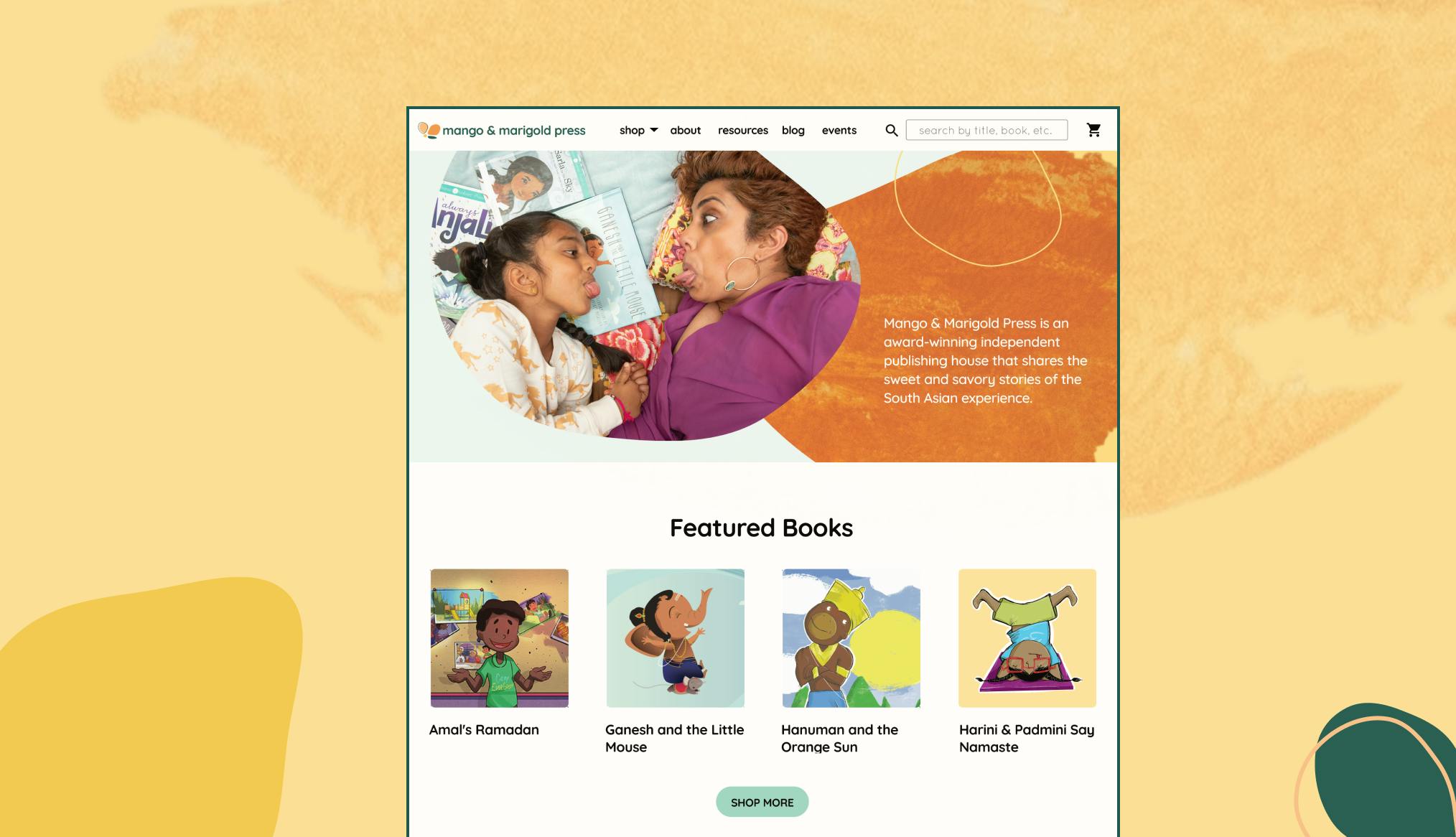
After creating low-fidelity wireframes for the site, we applied branding to the site. Here are some of the final screens from the site.


final designs of mango & marigold's site!
building the site + final product
The site was built as a custom Shopify template. While we considered other options, such as building a React site + hookup to the Shopify Storefront API, our client was already comfortable with the Shopify dashboard, and we wanted to keep disruptions to their workflow to a minimum. Building the site itself was a technical challenge in itself, as there weren’t many resources around building Shopify templates from scratch.
The final site can be viewed here!