Scout Website
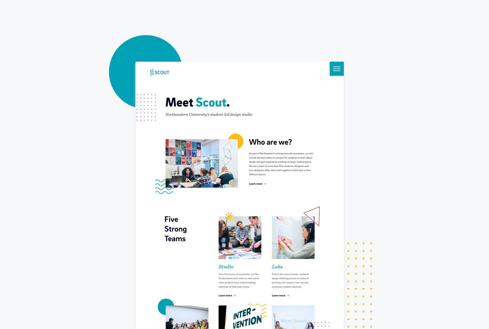
overview
Scout is Northeastern University’s student-led design studio. The organization formed in 2014 and first began as a studio offering design services, such as graphic design, ui/ux design, print design etc, to clients affiliated to Northeastern. While Scout is still built upon client work, the organization has expanded to become a design community for students, including design-thinking work for the Boston community and hosting speaker events and an annual design-focused conference. The initial Scout site was created in 2016. Since then, the organization has grown tremendously to its current five teams and over fifty members, and no longer reflected Scout as it is today. From a technical standpoint, the site was also incredibly hard to edit, with simple changes breaking the site. It was time for a redesign. As project lead, I worked alongside 4 designers/developers, in addition to receiving weekly design feedback from the executive director, ops director, and design director.
AREAS OF FOCUS
Web Development
UI/UX Design
Brand Design
TOOLS
Figma
Adobe Illustrator
Gatsby JS
Prismic CMS
ROLE
Project Lead
branding research
Before diving into the design, the team wanted to gain a better understanding of Scout’s brand, and ultimately, how we should convey Scout’s values via our designs. Through branding exercises, we gained a deeper understanding of what Scout’s brand is, and how that could reflect upon the site. Scout is a student organization that is upon professionalism while still being playful.
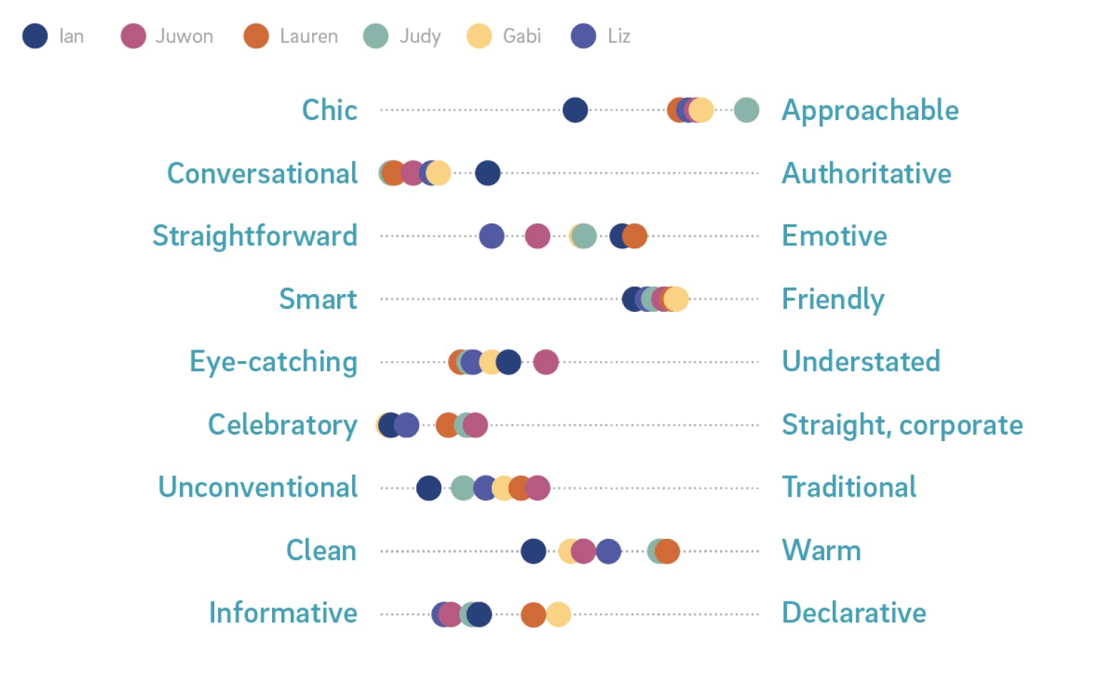
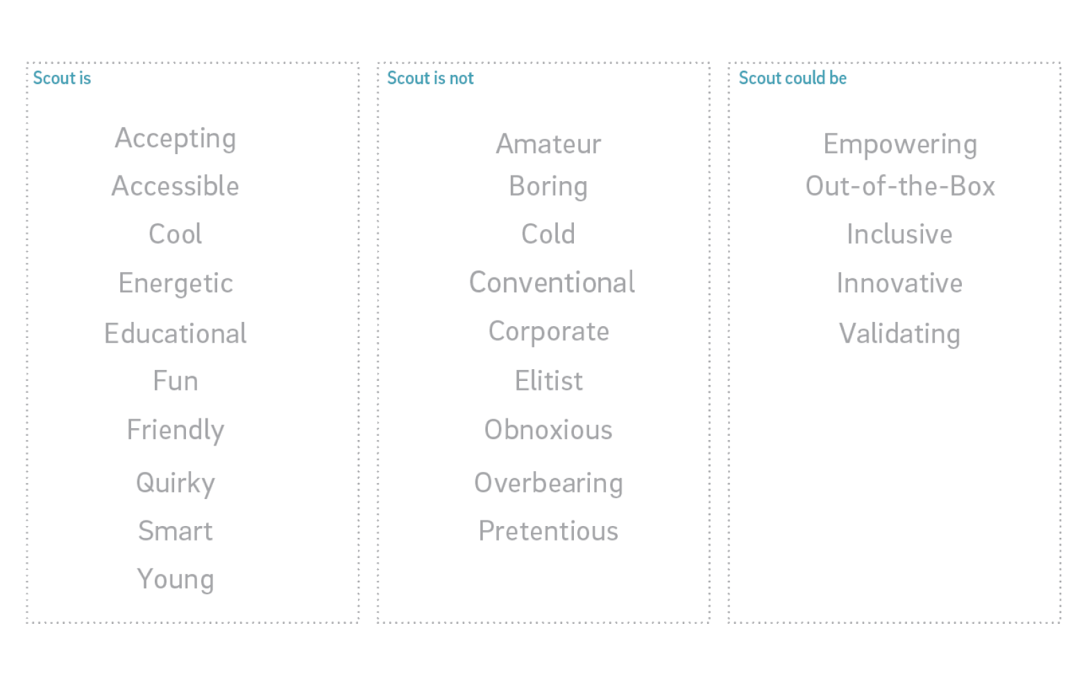
branding exercises: personality levers (left) Scout is, is not, could be ____ (right)
ux redesign
After establishing Scout’s core values, we moved into dissecting the user experience of the site. The previous site was confusing to navigate and did not include a lot of information, leaving site visitors confused about the organization, and what exactly Scout was. Because of Scout’s unique structure, there were a lot of things to consider.
As part of our brainstorm, I conducted a card sorting activity in which the team brainstormed information that would be useful to have on the site.
Some of the key issues to address:
- What exactly is Scout?
- How do you become a client?
- How do applications work?
- Which team is the best fit for me?
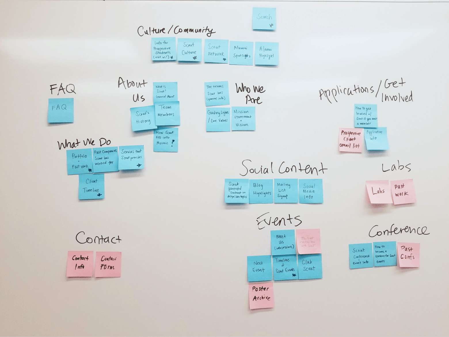
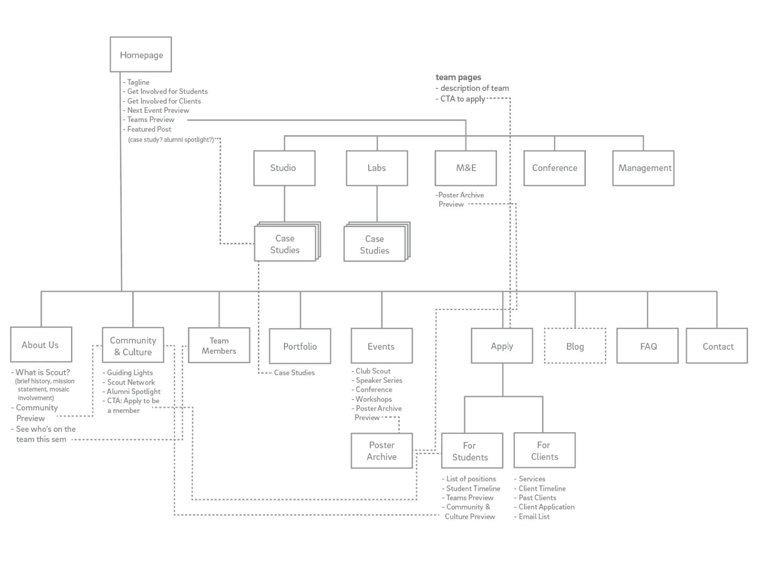
card sorting exercise (left), sitemap of the new site (right)
moodboards & brand exploration
In terms of the Scout visual brand, the team decided to do a refresh of the pre-existing brand. The Scout logo, along with its signature teal color, was already an iconic marker around campus, and we didn’t want to disrupt that.
For inspiration, we pieced together three different mood boards that conveyed different directions we could take the Scout brand - clean, bold, and quirky. We decided to go in a direction for a mix of clean and fun, which would convey both of Scout’s professionalism and playfulness.
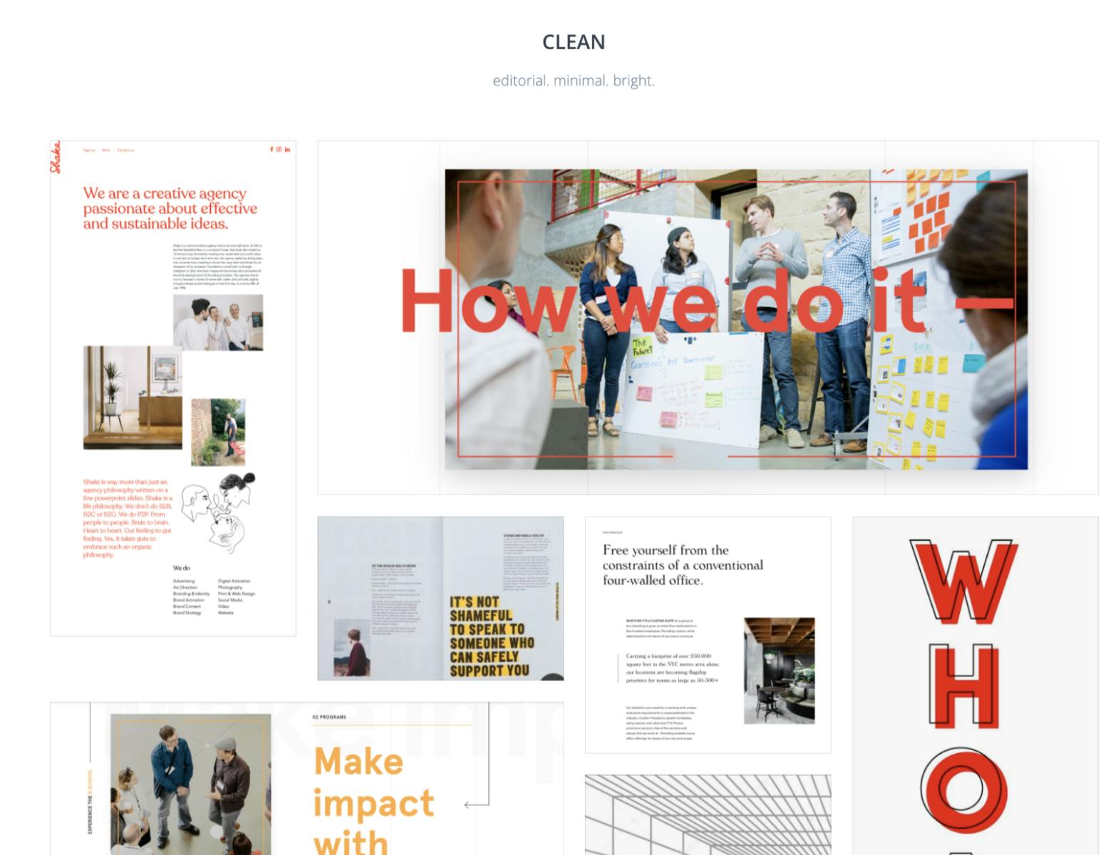
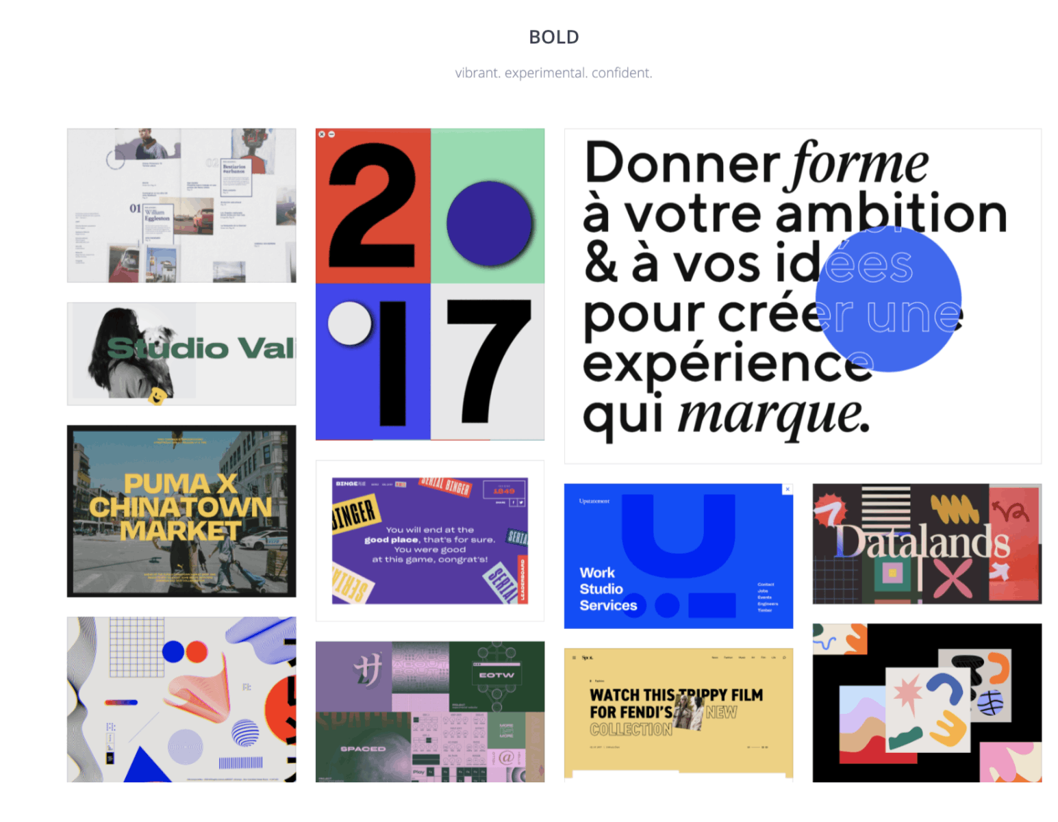
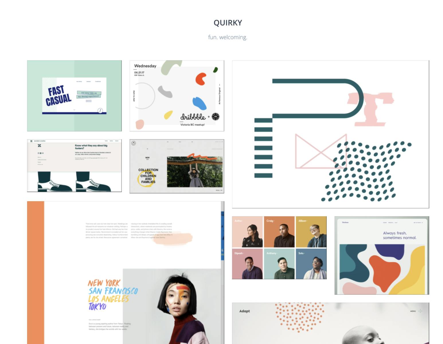
clean direction - editorial, minimal, bright (left), bold direction (middle), quirky direction (right)
brand refresh
The new Scout brand is clean, yet still playful. The color palette was derived from the previous colors by bumping up the boldness of the colors in order to make them more impactful. Brand elements are placed with intention in order to call out content on the page. The brand utilizes a mix of different shapes and outline styles, allowing for an extensible brand system.
low-fidelity wireframes
Before delving into applying our branding, we focused on creating low-fidelity wireframes for the pages of the site. At this point, we focused on how to best represent Scout and convey the necessary information. In order to alleviate the pain points discussed, we introduced many new pages that previously did not exist on the site.
Team pages: Scout operates within teams on a semester by semester basis. To someone unfamiliar with Scout, it was difficult to understand that the organization operated under teams, and what exactly each team did. A dedicated page for every team made it clear what each and every team did.
Informational Pages: The design-oriented, career-driven culture is a large part of being in Scout. However, to an outsider, it is unclear what being a part of Scout is really like. We wanted to showcase the Scout culture in order to attract talented, prospective applicants.
FAQ: While an FAQ existed on the previous site, it was very hidden and vague, which led to a lot of unanswered questions and emails to management. The addition of a categorized FAQ alleviates the inboxes of our executive and operation directors.
Challenges:
- How should navigation be structured?
- What should be the first impact when landing on the site?
- Should team pages all follow the same template?
- What type of format should case studies follow?
- How can the information be best conveyed to prospective students and clients?


a few of the low-fidelity wireframes of the site
applying brand
After landing a brand direction, the next step was applying the new branding to the low-fidelity wireframes. In addition to the application of brand elements throughout the site, we found ways to let the Scout brand shine via informational graphics.


final homepage (left) and about page (right) for the new site!
final product
Thes site was built using the JAMstack architecture and utilizes React JS, Styled Components, Gatsby, and the headless CMS, Prismic, as the content management system. The site is currently live and can be viewed here!